We often hear fractured statistics. They are offered to sway us in our beliefs. The poorest half of the population has only 10% of all the wealth. Or perhaps the richest 15% of the population has 80% of the wealth. This means that the poorest 85% of the population has a mere 20% of the wealth. But with such numbers how are we to compare one population with another? How much of the wealth do 85% of the poorest have in other countries? A way is needed to represent wealth or income distribution by one single number.
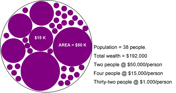
| Here is an artificial population of 38 people; the 38 circles. The bigger circles have the greater wealth. An egalitarian distribution is when all circles are the same size: the wealth is uniformly distributed. In the case shown 2/38 of the population - about 5% - have over half the wealth. The other 95% have the other half. | |
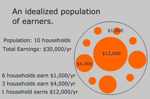 | Countries that collect taxes collect data, not on wealth, but on income. Here is another fictional population. It is more amenable to analysis. The orange ball sizes represent income rather than wealth. The ten circles represent ten households. Six of them each earn $1,000/yr. Three (fatter circles) earn four times as much. And one household (very fat circle) earns $12,000/yr. |
We can construct a Lorenz curve from the data represented in the image. In this kind of plot the abscissa - the horizontal axis - represents the fraction of the population starting from the poor and going to the rich. The vertical axis is the fraction of the total income earned by each fraction of the population. (The technical jargon is cumulative income because the arithmetic involves summing. To sum is to accumulate.)
| Here is what the Lorenz curve looks like for the information contained in the orange ball population of households. The lowest tenth of the population - a single household -earns 1/30 of all income. The lowest two tenths - two households - earn 2/30 of all income. And so on for each point on the curve until six tenths of the population is reached and these, all together, earn 6/30 = .2 of all income. In other words, the poorest 60% earn only 20% of all income. This finding is exhibited as a point specifically marked on the curve. The wealthiest household earns 12/30 = .4 or 40% of all income and it constitutes only the top tenth of the population. The next inflection point on the curve marks this fact - the poorest .9 of the population earn 60% of the income. All this detailed information and much more is collected into the Lorenz plot for any income distribution. | 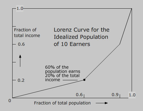 |
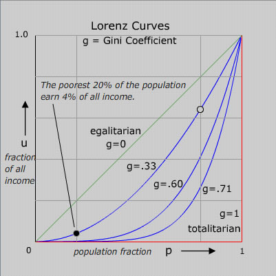 | A set of idealized Lorenz curves are shown in the figure. The sloping straight green line is the Lorenz curve of an idealized perfectly egalitarian society - where everybody has exactly the same income. The red Lorenz curve - horizontal and then vertical - is that for the extreme authoritarian or totalitarian society where one person has all the income. Curves for societies with intermediate income distributions are shown. To clarify the meaning of the curves, the significance of one point (black) on one of the curves is displayed. The open circle point on the same curve has the coordinates: 80% of the population earns 64% of the income. Or, what is equivalent, the richest 20% of the population earns 36% of the income. |
There are many possible single numbers to serve as a general measure of income distribution. To mark the skewness from egalitarian a very clever single number in common use is the Gini index. A good exposition is at http://www.leftbusinessobserver.com/Gini_supplement.html
"The Gini coefficient is a measure of inequality developed by the Italian statistician Corrado Gini and published in his 1912 paper 'Variabilite e mutabilite'. It is usually used to measure income inequality, but can be used to measure any form of uneven distribution."
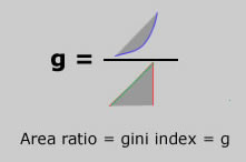
Quite simply the Gini index amounts to a ratio of two areas derived from the Lorenz plot: that between the green and the blue curve divided by the area of the triangle made by the green and the red curve. Here is a picture of the idea.
The Gini Index is zero (full equality) when everyone in the society earns exactly the same as everyone else. In a thoroughly totalitarian society, where all earn nothing except for the leader who earns everything, the Gini Index is 1 (or 100%). Needless to say, no country exists with Gini Index zero or one. Since the extremes are evidently unstable - they cannot persist - there must be an optimum GINI! What principle governs the optimization? I confess to not knowing. In the real world the Index ranges between about .25 (25% or just 25 in the published tables) to .70 (70 in tables).
A list of the gini indices for most of the countries of the world is given by the Central Intelligence Agency in its World Factbook.
July 2010
Marvin Chester
email